The Aesthetic Science of Color Coordination in Patio Furniture
Key Highlights
- Selecting the perfect color scheme is key to creating a welcoming ambiance in your outdoor space.
- Light, neutral tones offer a timeless appeal while bright pops of color deliver energy and vibrancy.
- Consider your home’s exterior, existing furniture, and the surrounding landscape when making color choices.
- Balance is key! Utilize the 60-30-10 rule to create a harmonious blend of colors.
- Don’t be afraid to experiment and personalize! After all, it’s your outdoor oasis.
Introduction
Your outdoor space is like an extra part of your home. The way you design it should show who you are. One important detail that many people forget is the color of their patio furniture. Picking the right colors can change your patio into a warm oasis or a lively spot for hosting friends. By carefully choosing your patio color palette, you can make it more interesting to look at. This will help mix design elements together, creating a charming outdoor living space!
Exploring the Science of Color Coordination in Patio Furniture
Color can quietly affect how we feel. Have you noticed how blue and green can make us feel calm and relaxed? That’s intentional! This idea, known as color psychology, is important for designing outdoor areas. When choosing patio furniture, think about the mood you want to set. Different color combinations can help you get the vibe you desire.
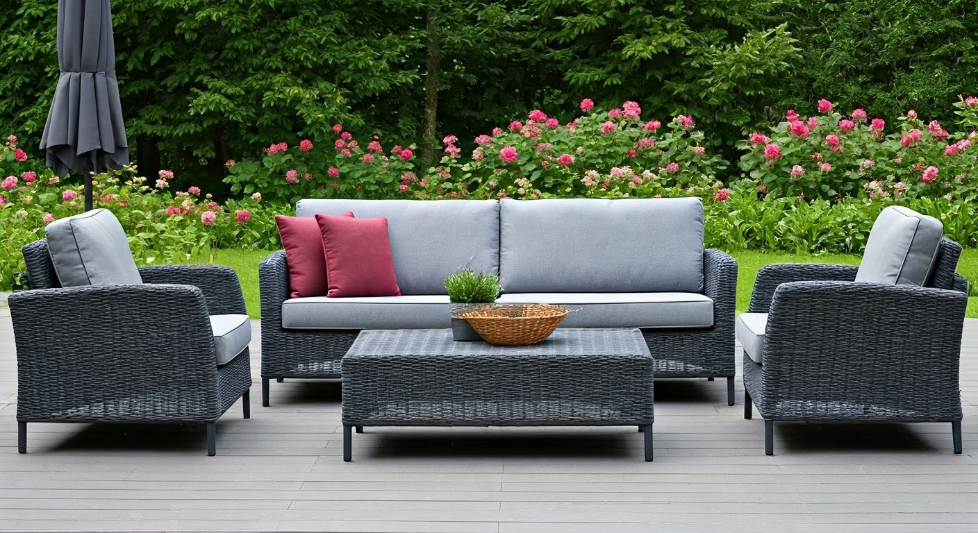
1. Monochromatic Elegance: All Greys with Texture Variation
In outdoor design, using different shades of grey can make your space look elegant. When you mix various grey tones in your patio furniture, you bring a modern look and extra depth to your outdoor space. The combination of light and dark shades makes your patio more interesting and special. Adding different textures can improve the overall look, giving a stylish touch to your outdoor seating area.
2. Coastal Calm: Whites, Beiges, Ocean Blues
Ready to escape to a seaside paradise right in your backyard? If so, meet the coastal calm color palette! This lovely mix of whites, beiges, and ocean blues quickly brings that relaxed, breezy feel we all love. Picture neat white wicker furniture with soft, ocean-blue cushions. It’s a perfect match for those who enjoy the calm of coastal life.
But there’s even more! Add some pops of color to bring in a fun touch. Think about coral throw pillows, sea-foam green lanterns, or a striped rug that has a bit of sunshine yellow. It’s all about those cheerful little details! With this coastal color scheme, your patio turns into a quick getaway. Whether you’re enjoying lemonade on a sunny day or having a casual seafood dinner under the stars, you’ll feel like you’re on vacation.
3. Bohemian Mix: Terracotta, Olive Green, Burnt Mustard
For those who love a style that is lively and different, we present the bohemian mix! This colorful trio of terracotta, olive green, and burnt mustard is a treat for the eyes! Imagine cozy cushions in warm terracotta, a rustic wooden table in deep olive green, and touches of burnt mustard in throws and decorations. It showcases bold colors and your personal taste, making any space feel welcoming and truly you!
The great thing about this color scheme is that it lets you be creative! You can mix patterns, textures, and vintage pieces however you like. Macrame wall hangings, bright lanterns, and vibrant green plants are great to add to this free-spirited area! Remember, it’s all about showing your unique style!
4. Minimalist Contrast: Black, White, and Natural Wood
Are you a fan of sleek design? If you believe that “less is more,” then you might just love the minimalist contrast color palette! This bold set of black, white, and natural wood shows how powerful simplicity and contrast can be. Imagine this: Stylish black metal chairs next to a simple white table, all on a warm, cozy natural wood deck. This classic color combination is popular for good reasons – it’s stylish and very chic.
This color palette focuses on clean lines and open spaces, giving a sense of simple sophistication. It also makes a great background for minimalist decor items like geometric planters, sleek lanterns, and a standout sculpture or two. With black, white, and natural wood, your patio transforms into a place full of minimalist elegance!
5. Seasonal Themes: Spring Pastels, Autumn Rusts
Who says your patio color scheme must stay the same all year? You can have fun with your outdoor area by changing it with the seasons! For spring, use soft pastels like blush pink, powder blue, and butter yellow. These pretty colors bring to mind fresh starts and blooming flowers.
As it gets cooler, switch to warm autumn colors. Think about rustic reds, golden yellows, and burnt oranges. Doesn’t that sound perfect for cozy nights by the fire pit? Here are some ideas to celebrate seasonal themes:
- Swap out cushion covers and throw pillows to match the season.
- Add seasonal colors with outdoor rugs, lanterns, and planters.
- Bring in seasonal plants and flowers for an extra pop of color!
The Impact of Color Psychology in Outdoor Spaces
We have talked about this before, but let’s be honest—color affects our mood more than we think. When picking a color palette for your outdoor seating area, you should think about the mood you want to create. Picture walking onto your patio and feeling relaxed right away. That shows how color psychology works!
If you want a calm space or an exciting area for outdoor gatherings, knowing how colors affect feelings can change your design decisions and how much you enjoy your patio. Let’s look at some common color groups and how they can influence our mood.
Warm vs. Cool Tones: Deciding What Sets the Mood
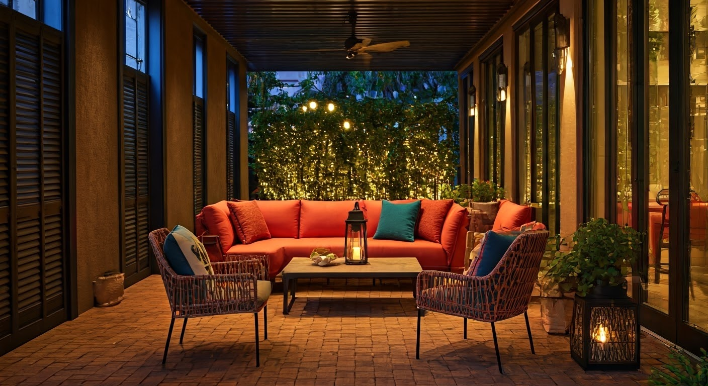
Let’s talk about warm tones! These include those bright yellows, vibrant oranges, and deep reds. They add energy and warmth to your outdoor space. Picture a patio with touches of terracotta or burnt orange. It makes you want to grill and invite friends over, right? That’s the magic of warm tones! They promote chat and make things feel friendly and social.
Now, if you like a peaceful vibe, let’s look at cool tones! These calming shades of blue, soft greens, and gentle purples are like a nice breeze on a summer night. They are soothing and relaxing. Think about lounging on a patio decorated with cool-toned pillows and accents. Ahhh, can you feel the stress just melting away? Cool tones help create calm and serenity, turning your outdoor space into a relaxing getaway from the busy world!
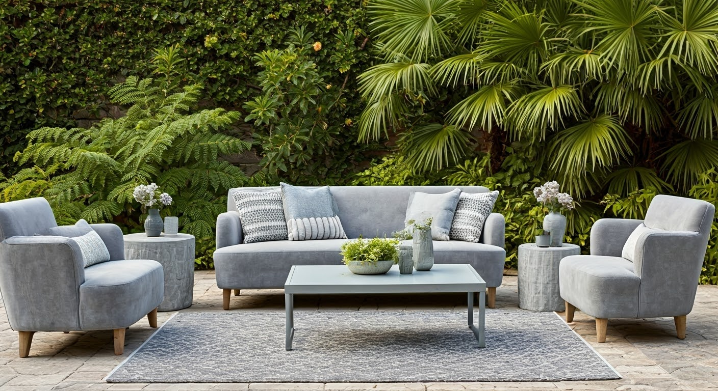
Neutral Tones: Crafting Timeless Elegance
Ah, neutral tones! They are the heroes of color! These shades include classic beiges, elegant grays, and fresh whites. They form the base of a lovely outdoor space! And guess what? They are not boring at all! They serve as a great blank canvas, letting you try out pops of color and different textures without making it look chaotic!
Imagine a patio with neutral-toned furniture. Now think about adding some bright throw pillows, a colorful outdoor rug, or planters filled with vibrant plants! The options are endless! Neutral tones give you the perfect background to show your unique style while keeping it all stylish and elegant.
Bold Colors: Creating Expressive Outdoor Zones
If you love to make a statement, it’s time to use bright colors in your outdoor space! Show your personality with pops of color that feel like “you”! Think sunshine yellow, electric blue, or a fun touch of pink! The goal is to create a space that showcases your energy and unique style.
Here’s how to use bold colors without making the space feel too busy: find a balance! Don’t forget the 60-30-10 rule. Use your bold color as an accent against a neutral background. This balance lets your personality shine! So go ahead, let your creativity out!
Nature-Inspired Palettes: Evoking Earthy, Calming Vibes
Want to make an outdoor space that feels like part of your garden? Let’s bring nature in with colors inspired by the outdoors! We mean earthy browns, soft greens, peaceful blues, and even bright yellow to copy those happy flowers! These colors make your patio feel calm and connect it to the beauty around you, changing it into a peaceful oasis.
Think about adding features like wooden furniture with a natural look, cushions with leaf designs, or a bright green outdoor rug. And remember the plants! Lush greens and colorful flowers improve the natural feel, making your outdoor space look calm and beautiful.
Practical Tips for Mastering Patio Furniture Color Schemes
Choosing the right colors for your patio is a fun journey, so get ready to enjoy it! Your outdoor space is like an extension of your home. Use your personal style to guide your choices. Remember important factors that can affect your design, like sunlight, climate, and how your colors will match with what you already have outside.
Before you jump into a bunch of paint samples, let’s look at some simple tips to help you create a stunning color scheme for your patio furniture that also fits nicely with the area!
The Role of Climate and Lighting in Color Selection
Ah, the great outdoors! We really love it, but it can be a little unpredictable. One minute, it’s sunny and bright, and the next, the weather acts upset! That’s why you need to think about your local climate and how much natural light your patio gets during the day.
If you live in a sunny spot, go for lighter and cooler colors like refreshing whites and calming blues. These colors reflect sunlight and help keep your furniture from getting too hot. But, if your patio is more about relaxing in the shade, warm up the area with earthy browns, bright yellows, or fun pops of energetic orange!
How to Blend Furniture Color with House Exteriors and Landscaping
Imagine this—your patio colors do not match your house’s exterior or landscaping! Not a good look, right? We want your outdoor space to feel like a natural part of your home, not a design mess!
Take a moment to think about the colors of your house siding, the nice window frames, and your green lawn. Are there any strong colors or tones? If your house has a brick exterior, think about using warm, earthy colors for your patio furniture!
The 60-30-10 Rule for Balanced Color Distribution
Designers have a good reason to follow this golden rule! The 60-30-10 rule helps you create balance and harmony in any space, especially on your patio!
Here’s how it works: 60% of the colors should be your main color. This is the star of the show! It could be the color of your walls, your outdoor rug, or even your furniture. Next, 30% should be your second color. This color adds depth and contrast. Lastly, 10% is for your accent color. This is the little pop of personality that brings everything together!
Conclusion
Color coordination in patio furniture is more than just looks; it’s a way to change your outdoor space. From simple styles to seasonal themes, colors can greatly affect mood and feel. Knowing about color psychology helps in creating warm and inviting outdoor areas. Remember to think about the climate and lighting, and how your colors match with your house. These tips are important for work on patio furniture designs. Following the 60-30-10 rule for color balance can make your patio look great easily. Use the art of color coordination to update your outdoor oasis with charm and uniqueness! Your patio can show your creativity and taste while also increasing your property’s value.
Frequently Asked Questions
What are the Best Color Schemes for Increasing Resale Value of Property?
Neutral colors usually have a better resale value. They attract more potential buyers. Common choices like beige, grey, white, and natural wood tones create a classic look. These colors show timeless elegance and give buyers a blank slate to imagine their personal style.